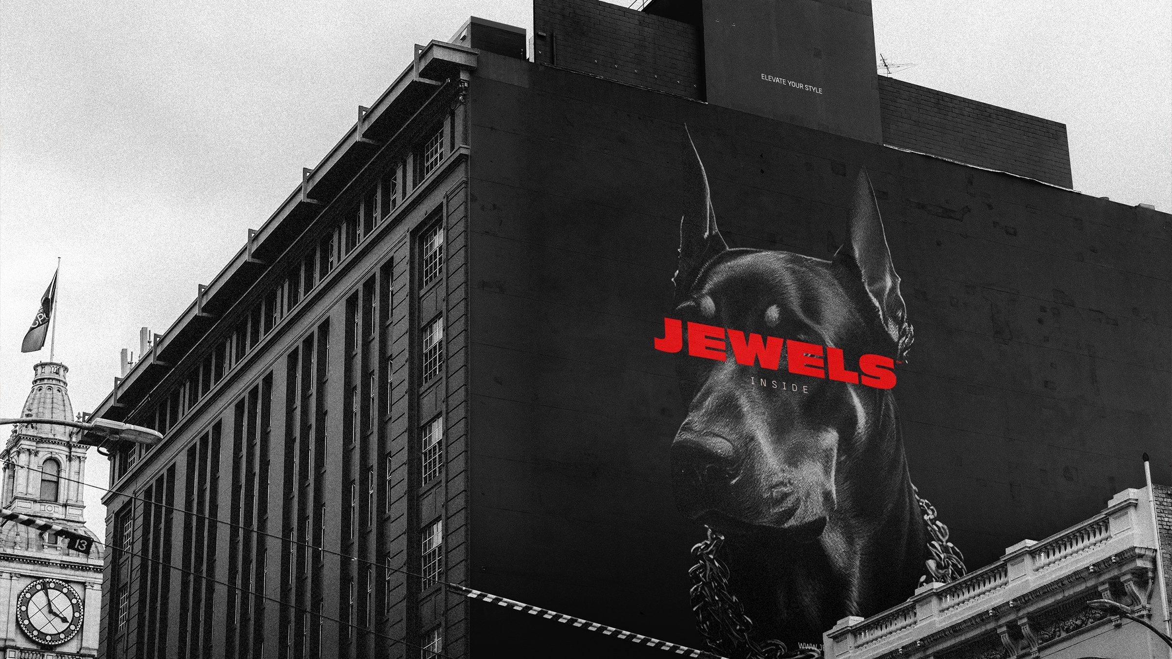
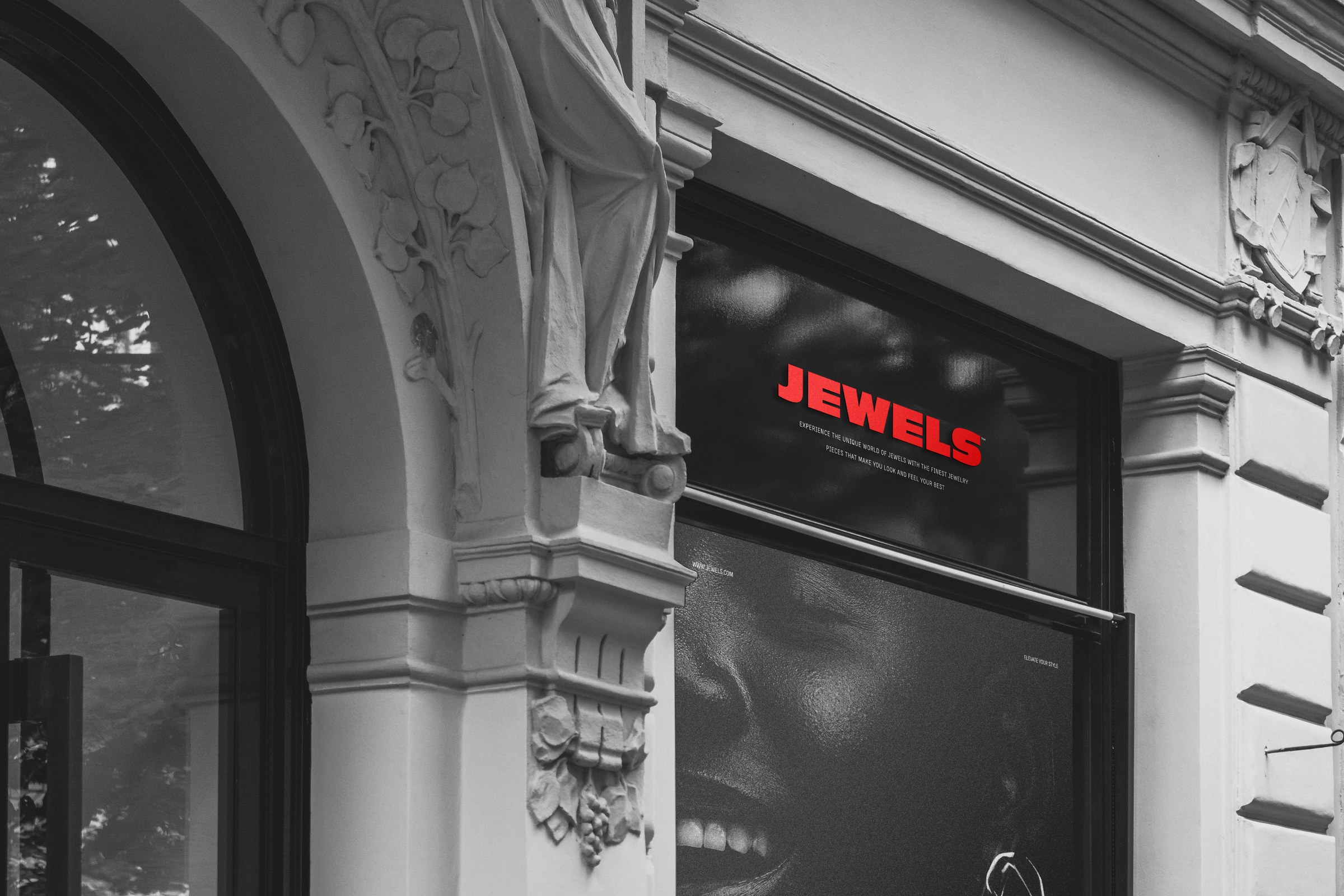
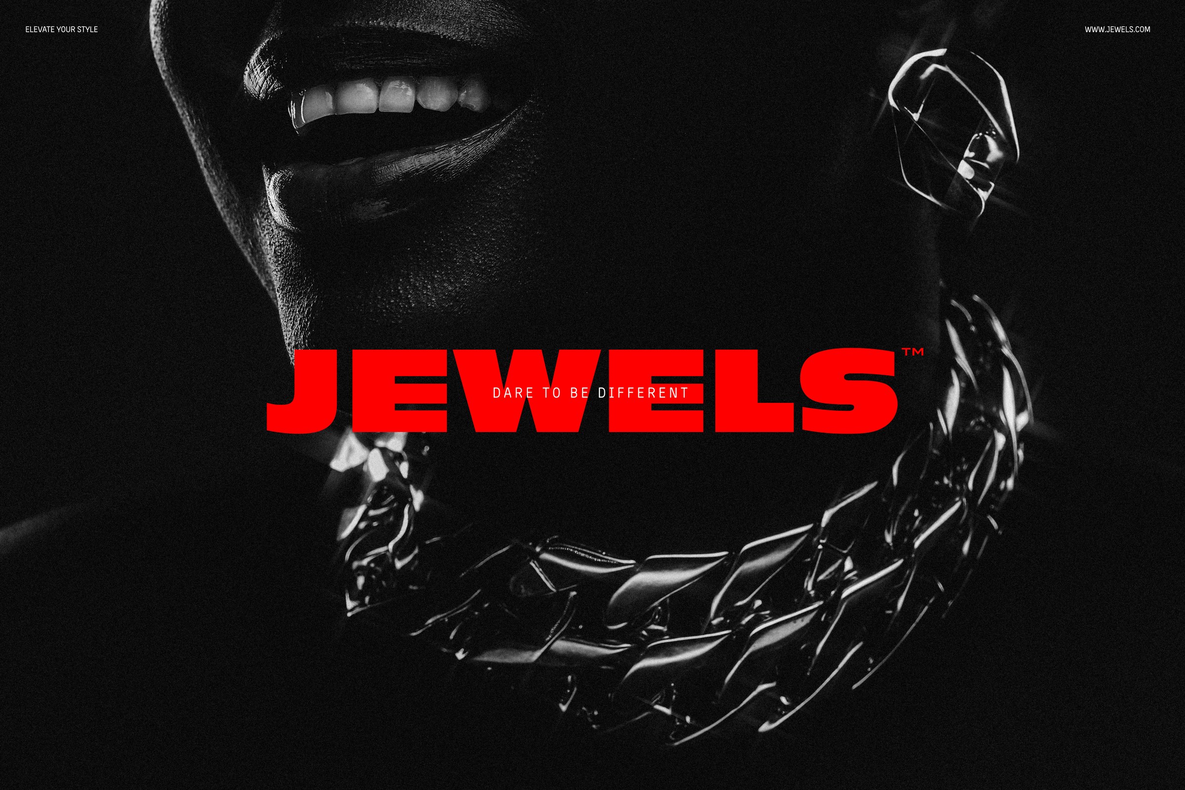
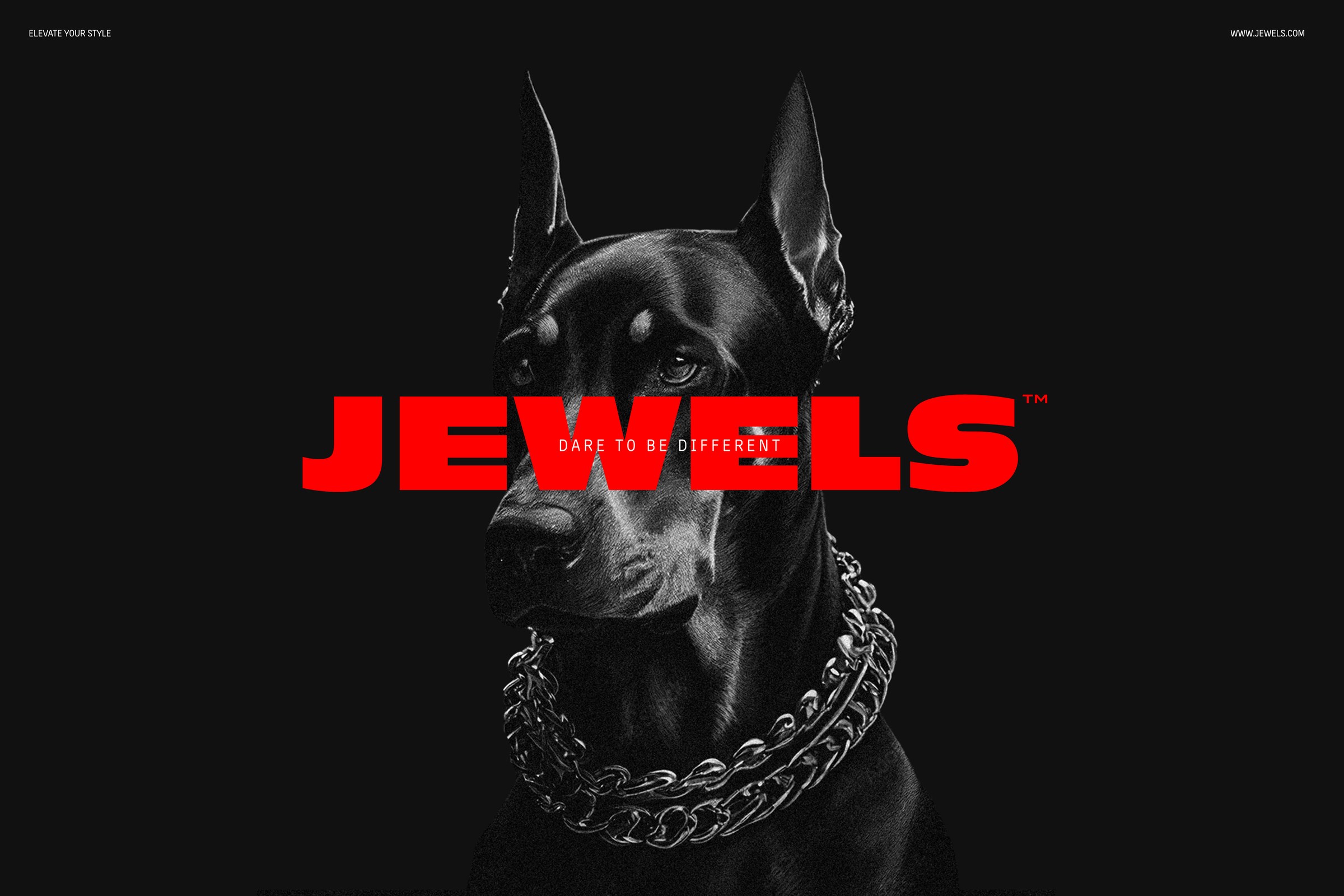
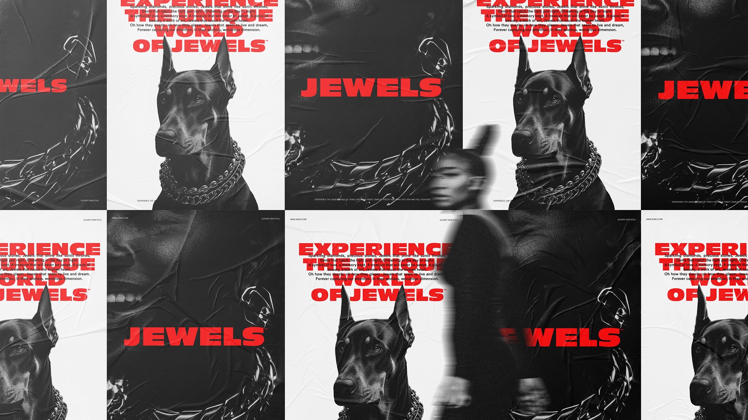
The work leans hard into contrast: soft product, hard art direction. The category defaults to soft light, pale skin and whispered typography. Jewels wanted the opposite: a label with an attitude that could sit next to fashion and streetwear without apologising for the price point.